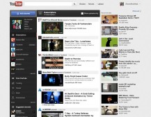
The online world is in a buzz over the major redesign of YouTube that launched yesterday. Though many are focused on the social integration, we think the bigger shift taking place is one from creators to curators. If the YouTube of 2006 was the place to upload your funny videos, the YouTube of tomorrow is the place where you can kick back and find something interesting.
YouTube has realized it’s hit a wallthe same wall that every successful social sharing platform hits. When too many people share too much mediocre stuff, the truly great stuff gets buried.
The web is moving from a place to SHARE to a place to CURATE with new startups like Pinterest, Snip.it, Gimme Bar and others hoping you’ll make sense of the mess we’ve made in our mindless sharing. So rather than uploading another shaky video of your cat, YouTube now wants you to help sort through it’s breadth of videos and make some sense of the madness.
Why the shift?
Well, up until now, YouTube has been relying on others embedding their videos on Facebook and Twitter to deliver you the best content. While it’s worked well for spreading viral videos wide and far, it hasn’t been great at pulling viewers to the main site. YouTube claims to get 3 billion video views every day, but youtube.com is estimated to get only about 1 million visits. It’s safe to say that almost 999 of 1000 people are watching these videos somewhere else.
What’s New?
It starts with a useful homepage (finally!). Now all the channels you’ve subscribed to are cleanly laid out on the left with a Facebook-inspired feed of all their latest activity down the center. YouTube has finally found a clear interaction model for its users. Every user has a single channelMy Channelthe home for every video you upload, like, or add to a playlist. Other viewers can subscribe to your channel and follow your feed (sound familiar?).
You can also now customize how your channel looks with different backgrounds, layouts, and even what content subscribers will see. Plus, the YT design team has finally pulled its act together and made the overall visual design much cleaner (inspired, I’d like to think, by Short of the Week ;).
What does it mean?
What about Vimeo? Vimeo is still the better place to go for great contentespecially short films. But this step toward a new discovery model and improved design shows that YouTube is looking ahead. What’s Vimeo’s vision of the future?
With Hulu growing much more modestly these days and Netflix struggling financially, there’s a growing need for an online entertainment destinationa place to go regularly and find quality entertainment. That’s something that, for the last 5 years, we’ve tried to be here at Short of the Week in our own small little way.
What do you think? Will YouTube become an entertainment destination for you?
 Andrew S Allen

